Track Name
Track Artist
year
genre
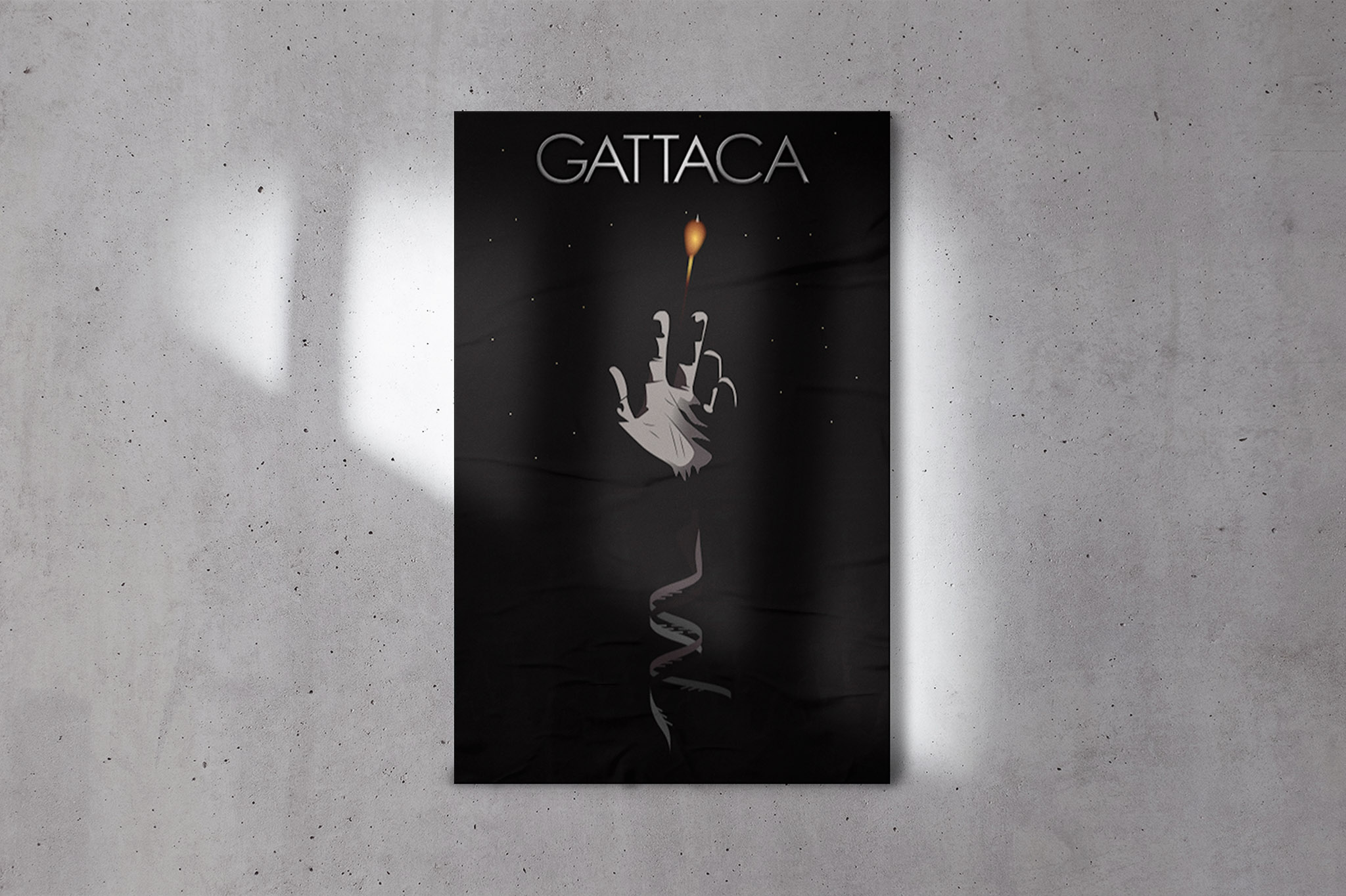
GATTACA Poster
The movie GATTACA heavily revolves around genetic discrimination. The main character, is trying to become an astronaut despite not legally being allowed because he was born naturally and was not genetically modified. His left handedness gives him away, which is why I illustrated a left hand reaching for the space shuttle. Also, the arm unravels into DNA strands to represent the important genetics theme in the movie.
❮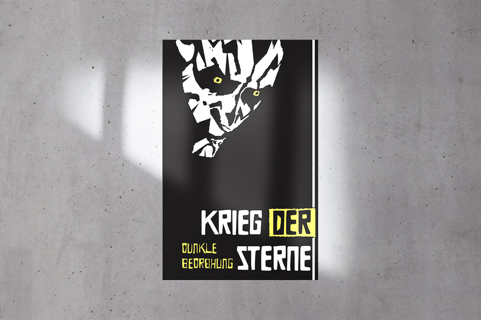
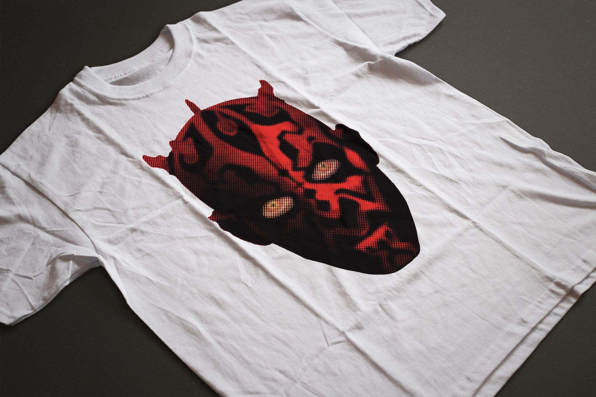
German Expressionism Darth Maul Poster
Here the goal was to make a poster in German Expressionist style. Influenced by the powerful woodcuts of German Expressionism, we created a jagged Darth Maul portrait. The text translates to: Star Wars: The Phantom Menace This was a group effort, but I was the illustrator of the group’s ideas and Godwin Appiah also helped with the finishing touches.
❮
Wong's Lion Logo
The spec sheet I created for the lion logo I created for the Wong’s restaurant I made up. It’s a traditional ink style rendition of a Chinese lion dog or shishi. I got the idea after taking a picture of a stone lion statue that flanks the gateways to Montreal’s Chinatown.
❮
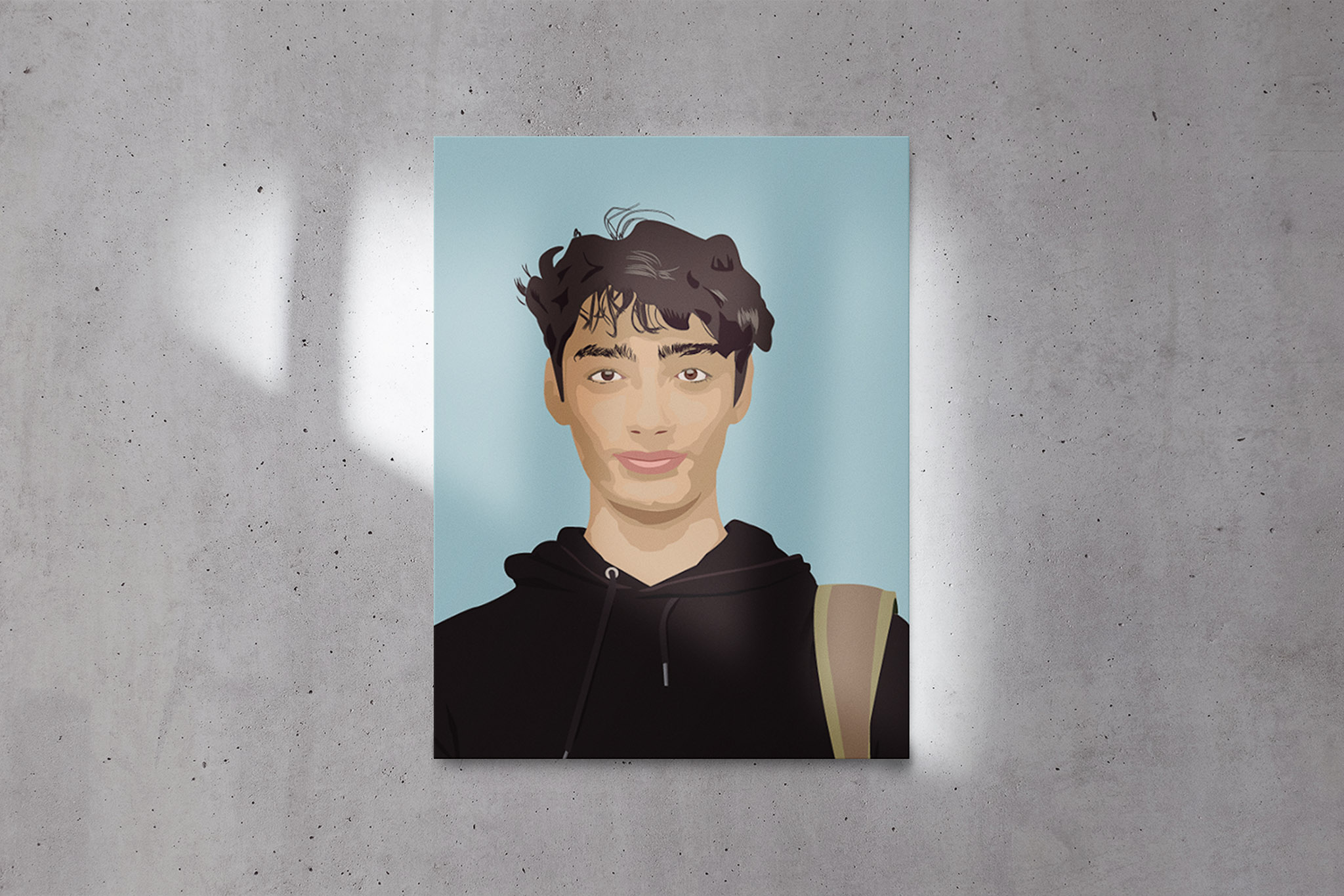
Self Portrait
A vector based self-portrait. I never did a self-portrait before using Illustrator, so I think this turned out really well. I kind of just figured it out as I went, starting at the neck and face, before moving onto the hair and finally the hoodie and backpack strap. I did everything in grey before adding colour.
❮
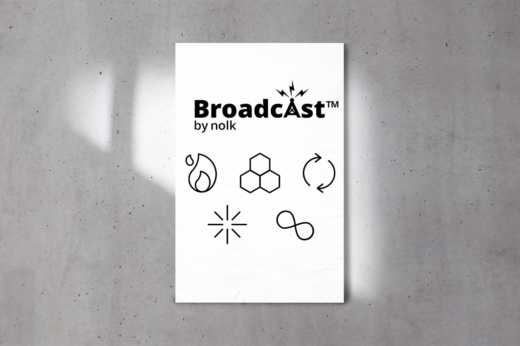
NOLK Broadcast logo and icons
Logo and icons created for NOLK's Broadcast service. We ended up simplifying the icons drastically through the design process. I personally like some of the earlier icons much better as they had much more character. In general design is going more and more simple everyday, I find everything is starting to look the same.
❮