Track Name
Track Artist
year
genre
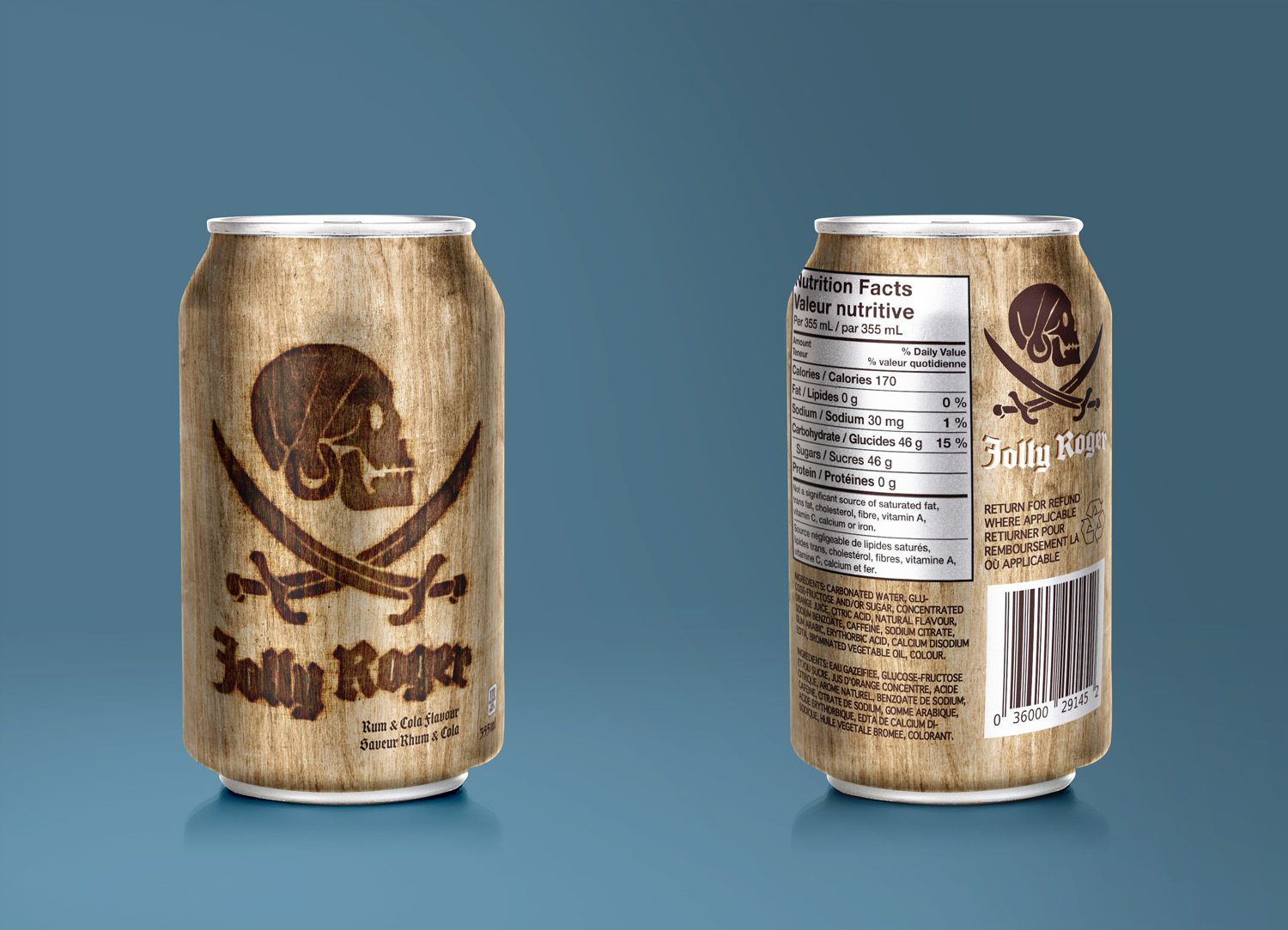
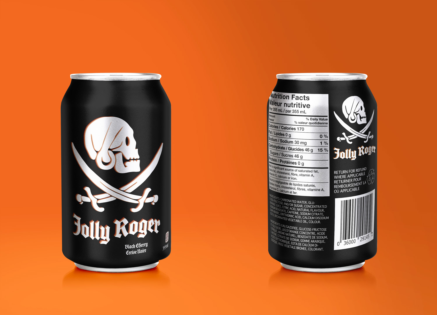
Jolly Roger Soda Cans
A concept for a soda brand’s cans. I took my favourite elements from Calico Jack’s and Henry Avery’s pirate flags then added the pirate feeling black-letter font. The classic can is simple black and white like a real Jolly Roger flag. It also has subtle red accents representing the black cherry flavor.
The second Jolly Roger soda can is made to look like a wood burn engraving, like an old barrel. This is to represent the flavor of rum and cola, since rum was kept in barrels by pirates.
For the third flavor, lime, I wanted to give it a tropical theme, so I made the logo into an desert island using Photoshop


Magazine Cover
The task here was to create a magazine cover. Starting with the logo, I used one of my favourite fonts, making the letters ultra bold and bringing them closer together. The space between the A and U seemed to disrupt the flow of the letters so I filled it up. I then took photos of a pair of sneakers I had just gotten for the cover. Finally, I filled the negative space with teaser headlines and matched the text to the colour of the shoes
❮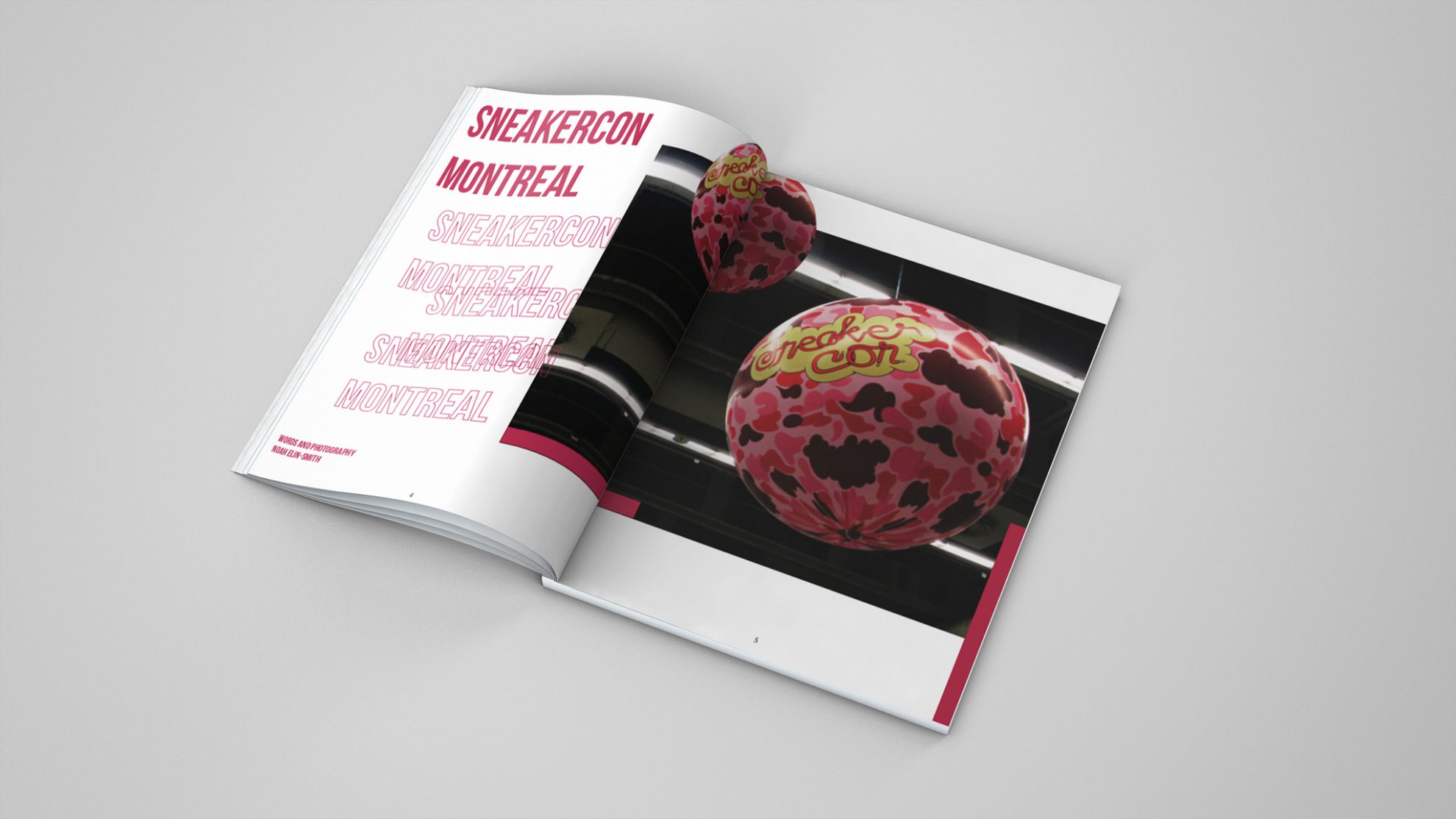
Magazine Spreads
Here are my two favourite spreads of the six I did for a magazine layout project. All the photography was my own from the inaugural Sneakercon in Montreal. I started by throwing together the title page, matching the asymmetrical pictures and accents throughout the spreads.
❮

Reader's Profile
A quick page layout for a reader’s profile, that I think turned out really well. The magazine was about Montreal, so I started by adding the picture I took of one an iconic Montreal high rise. I then put in the text and added the bars, which mimic the lines on the building. They also serve to lead your eye around the page
❮
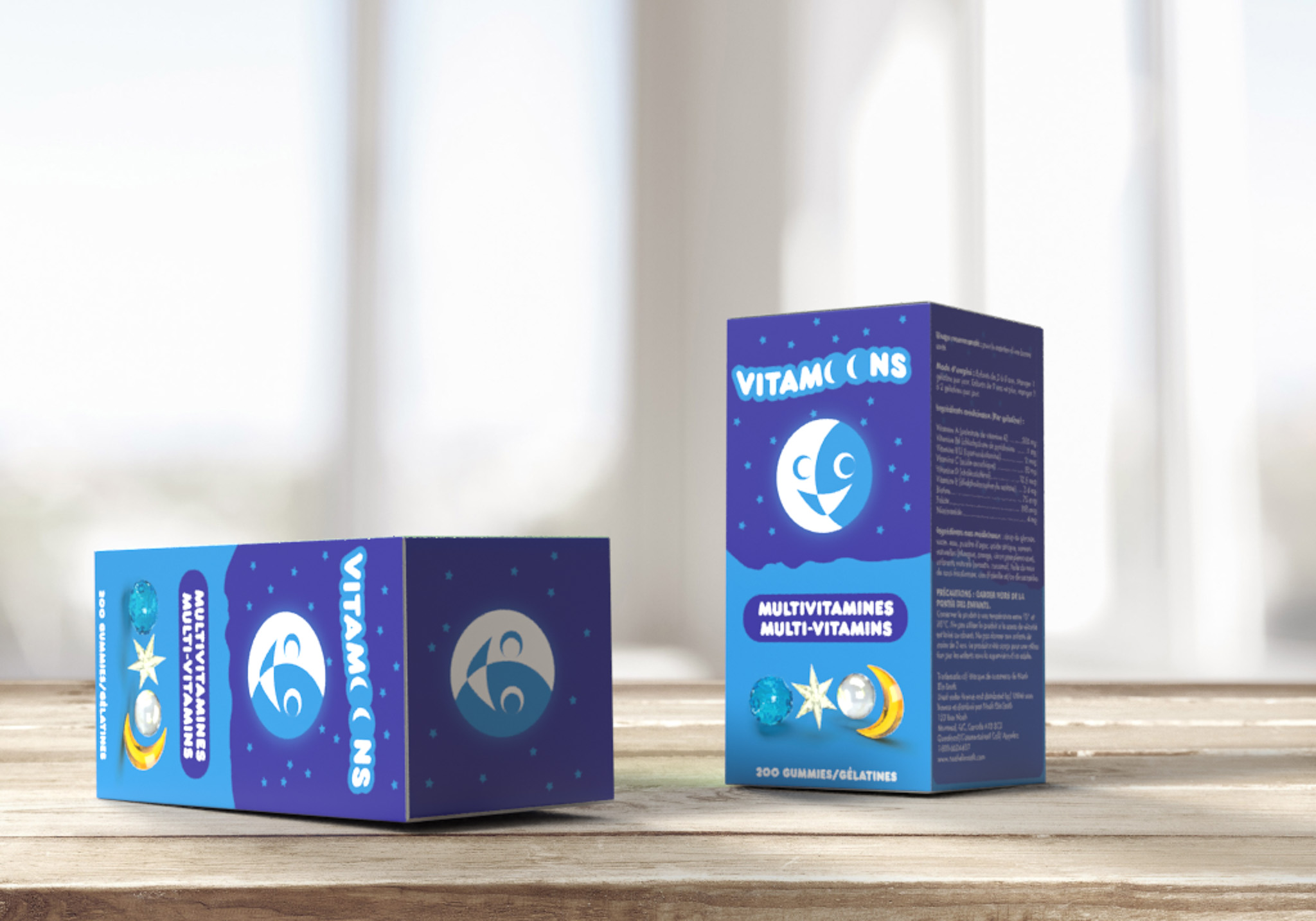
Vitamoons Packaging
Here I had to create the packaging and branding for a children’s vitamin brand. To appeal to kids, I created a playful name, Vitamoons, and a smiling moon logo. The gummies I then modelled after playful shapes of stars and moons too.
❮
Wong's Menu
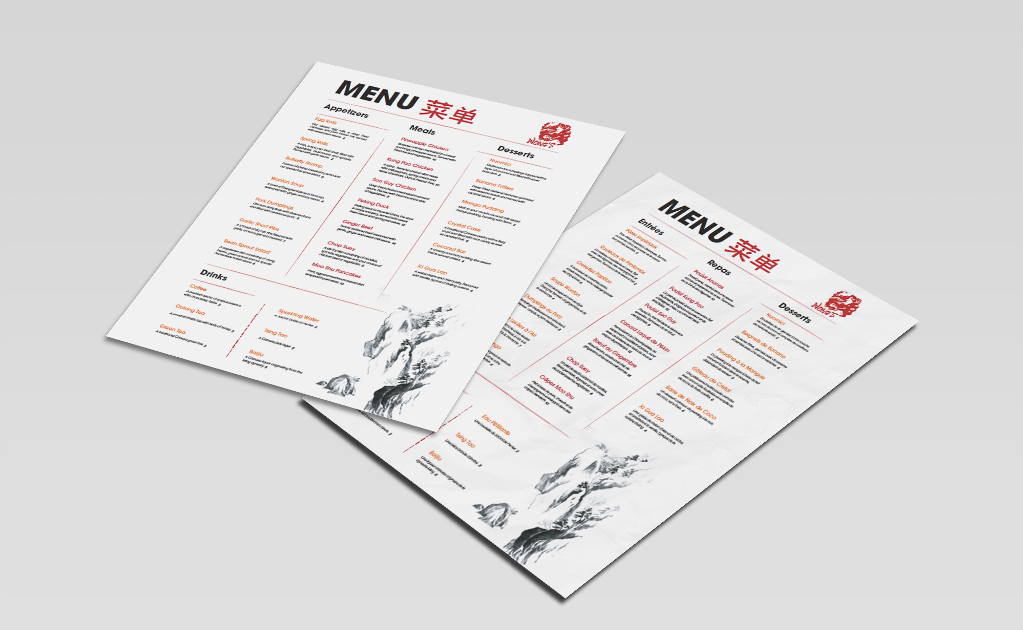
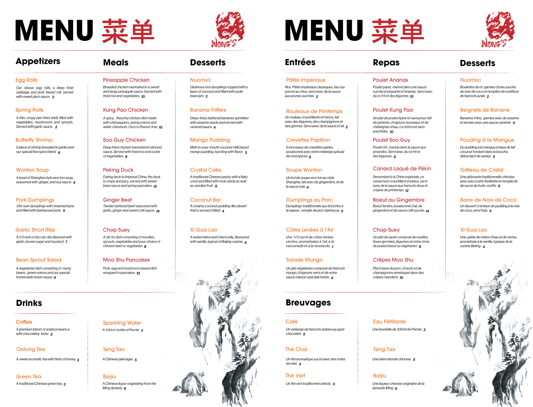
A bilingual menu for a concept Chinese restaurant, Wong’s. I kept it modern and minimalist but added a royalty free, Chinese, ink landscape to keep match the logo and maintain the theme.
❮

MFA Brochure
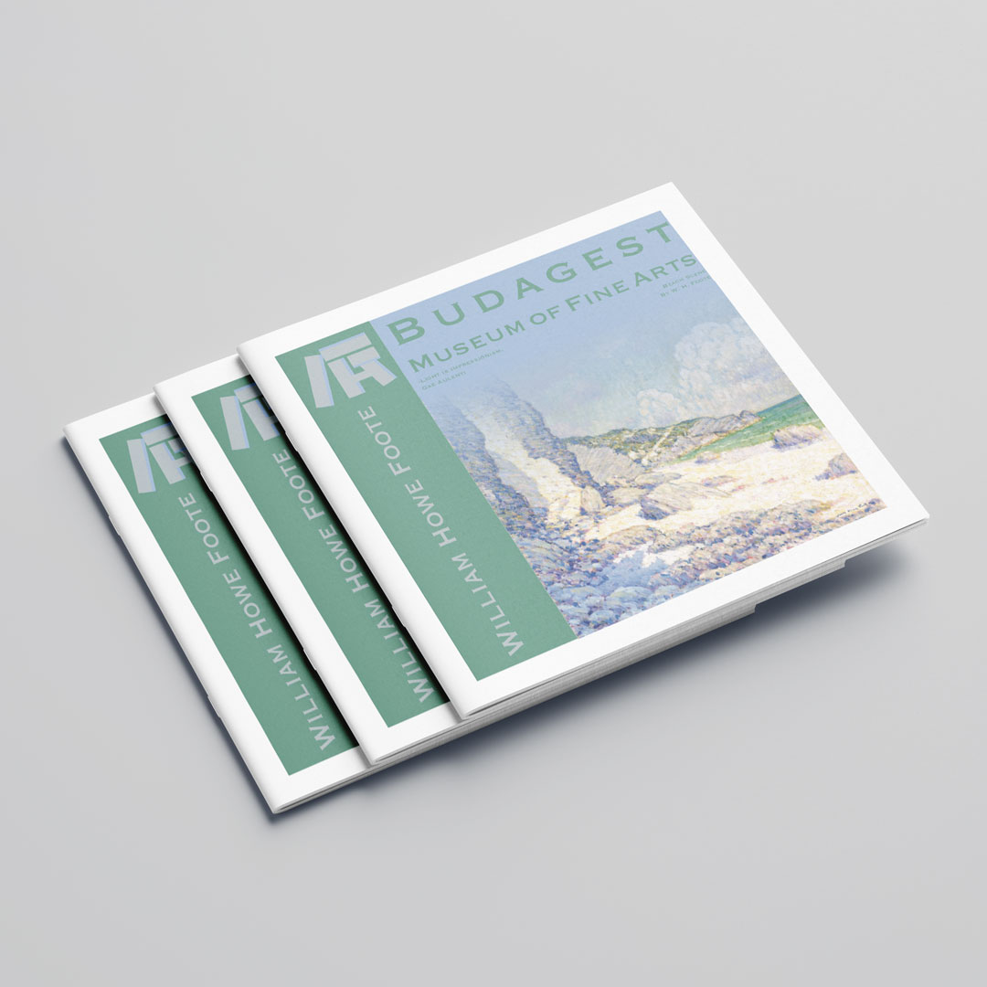
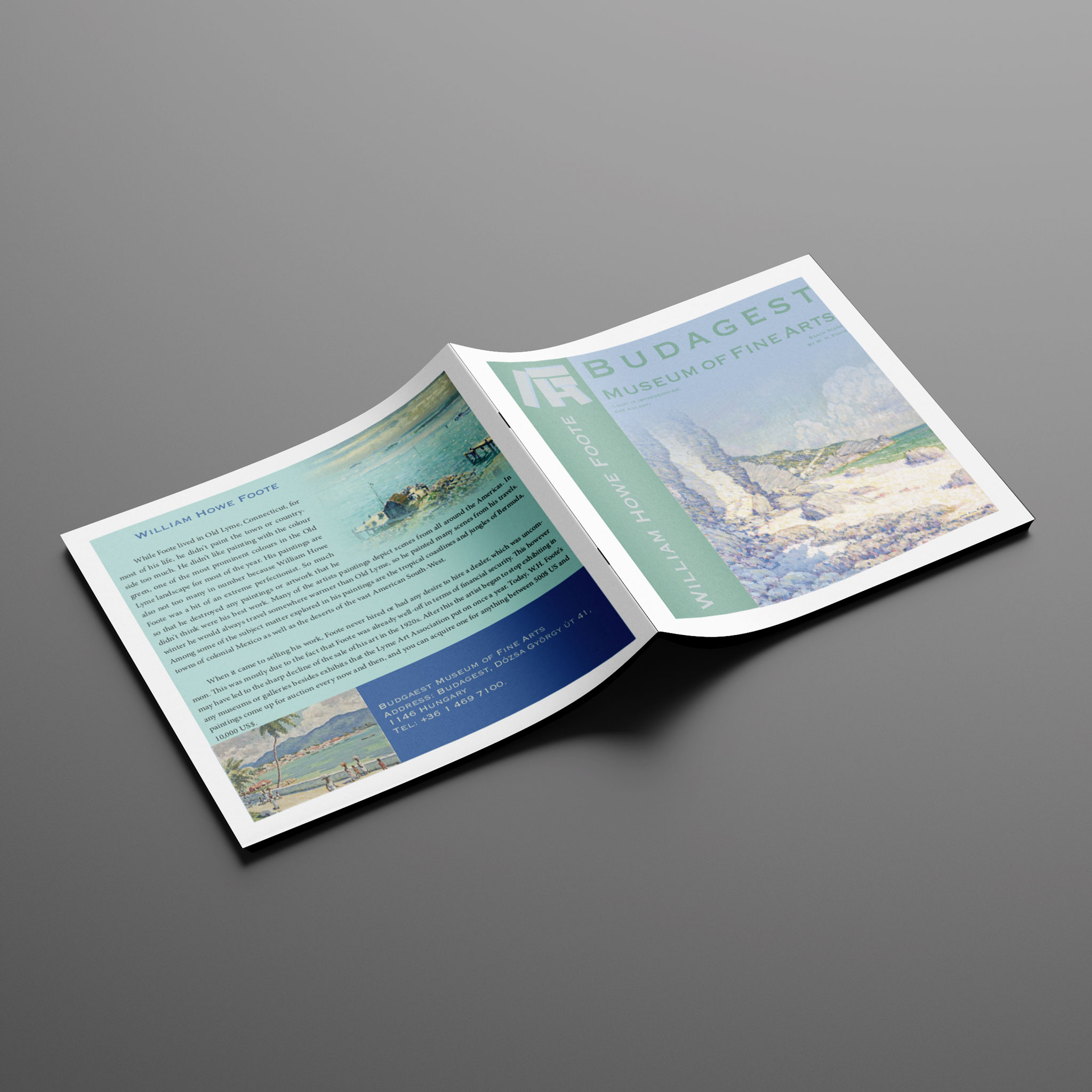
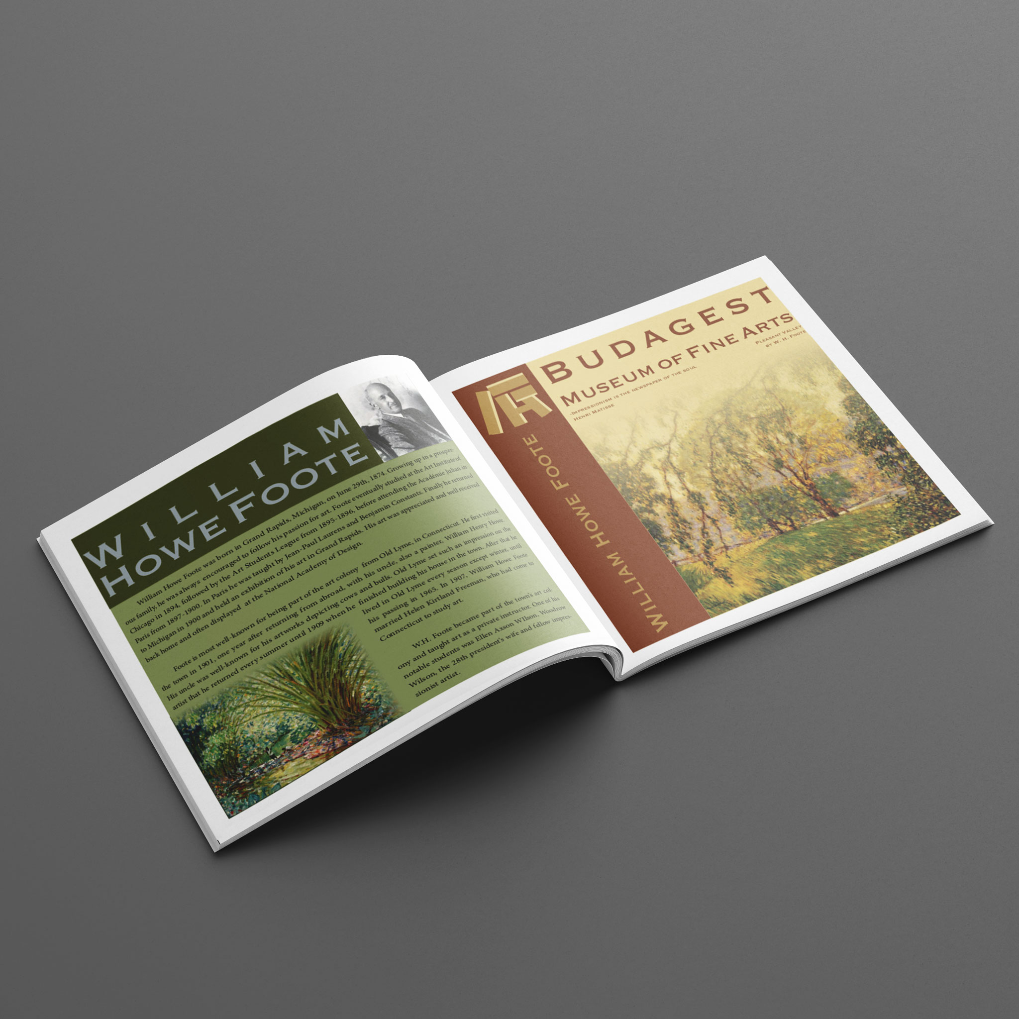
Tasked to design a pamphlet to promote an exhibit at a fictional Museum of Fine Arts. Budagest is not a typo, but a conscious decision to not infringe on copyrights. I chose some of my favorite artworks from the artist William Howe Foot, then drew the colors for the booklet based off those paintings.
❮
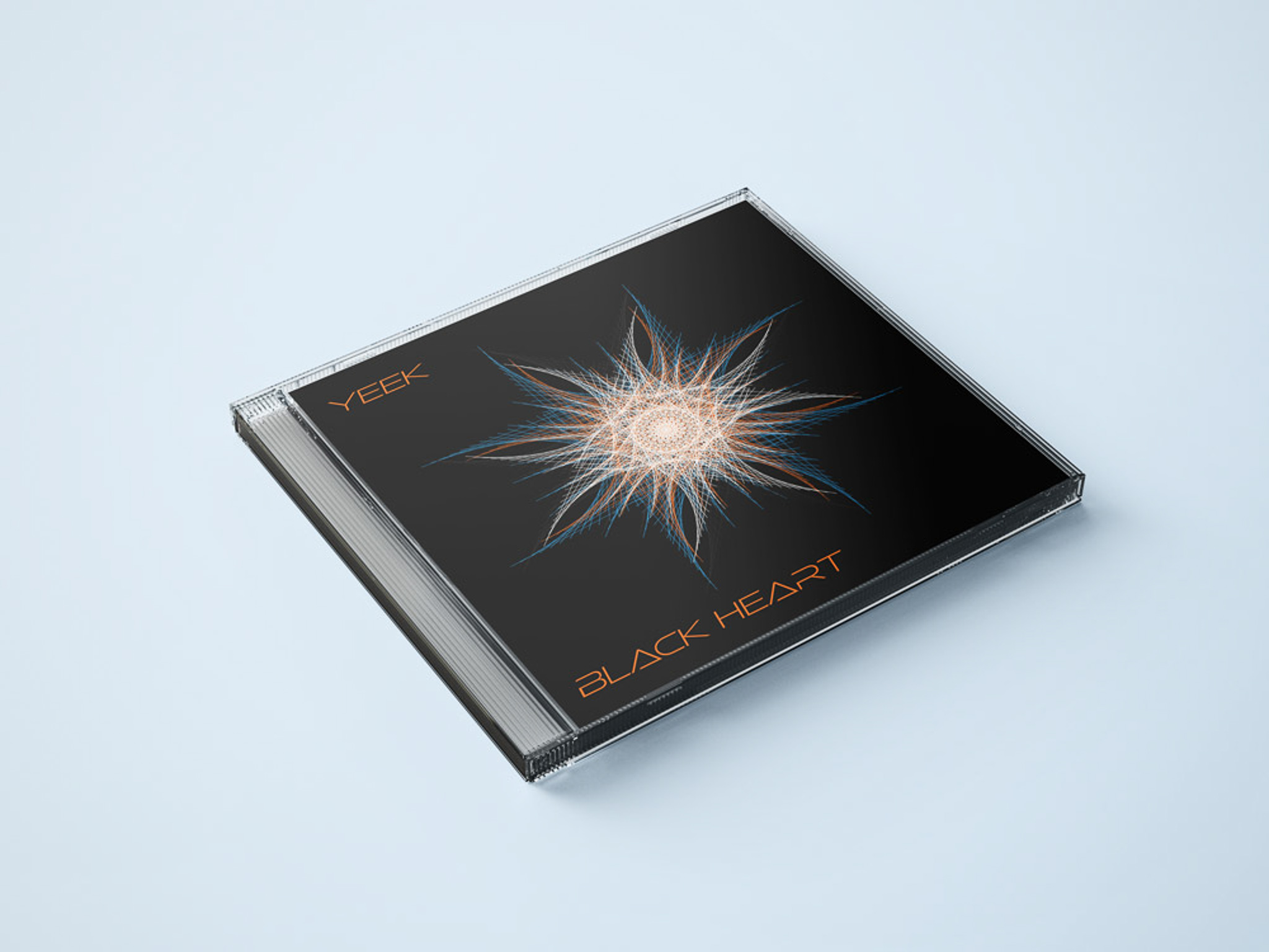
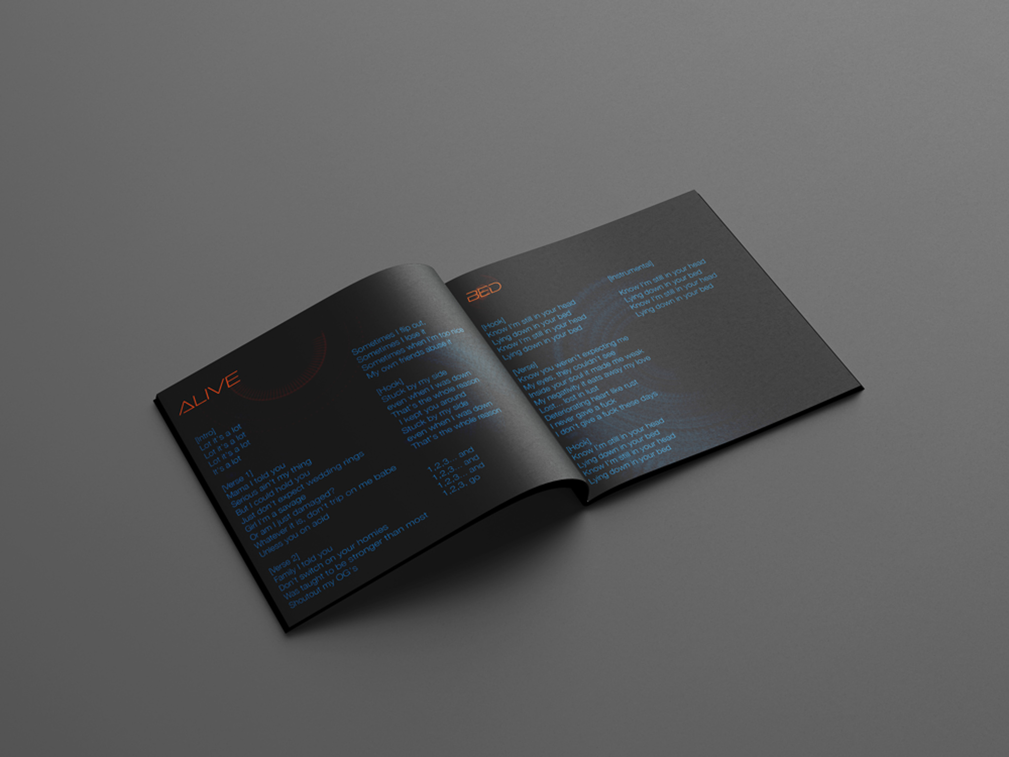
Yeek Alternative Booklet Design
An alternative design for Yeek’s Blackheart EP album cover and booklet. I created it when tasked with redesigning an existing album cover and artwork. The cover graphic is only made of straight lines. It gives off an organic look, almost like a living entity, but in an unfamiliar alien way.
❮

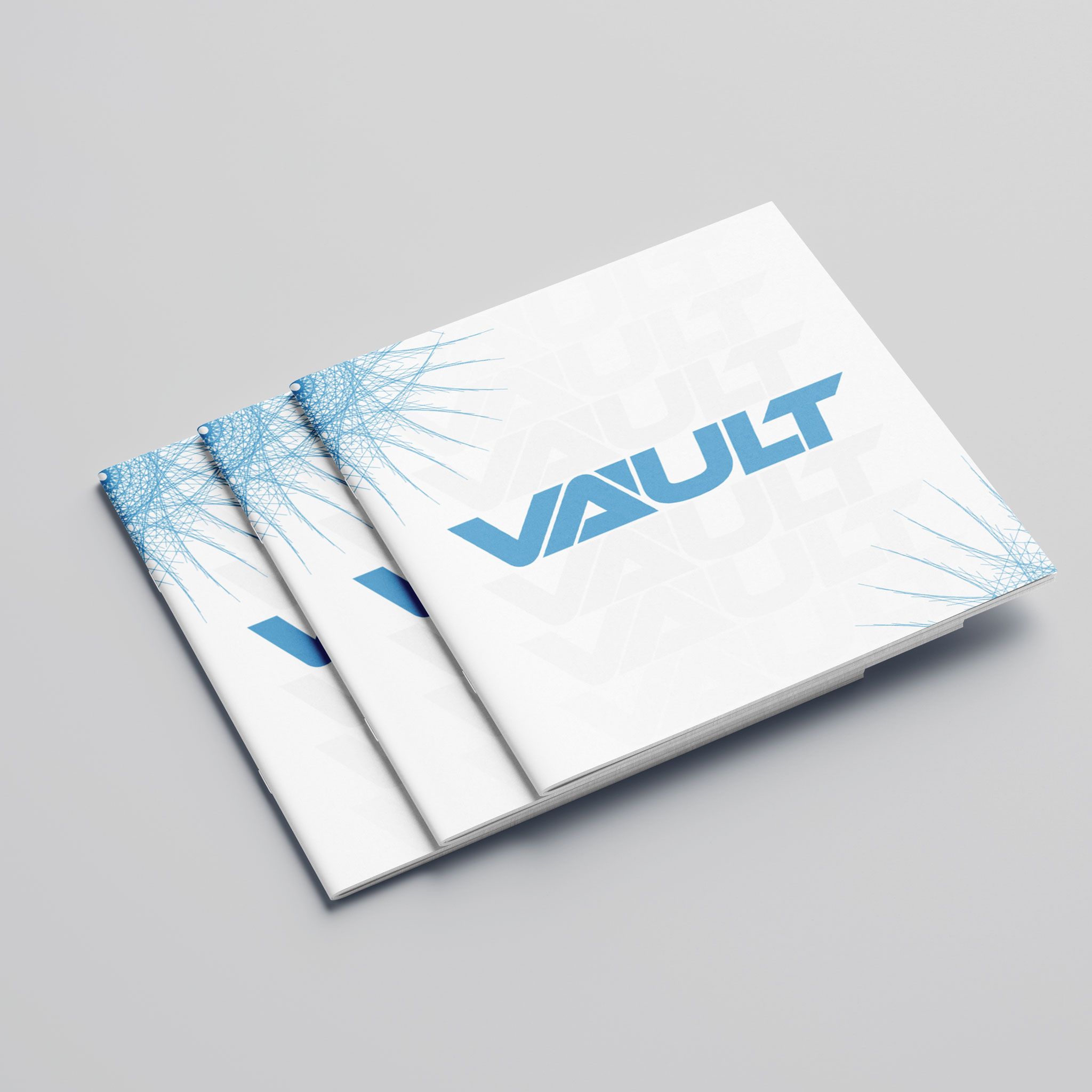
Vault Style Guide
Style Guide for Vault, a graphic design firm I may launch in the future. This document establish colors, logos, fonts and imagery for Vault as well as some of it's values.
❮
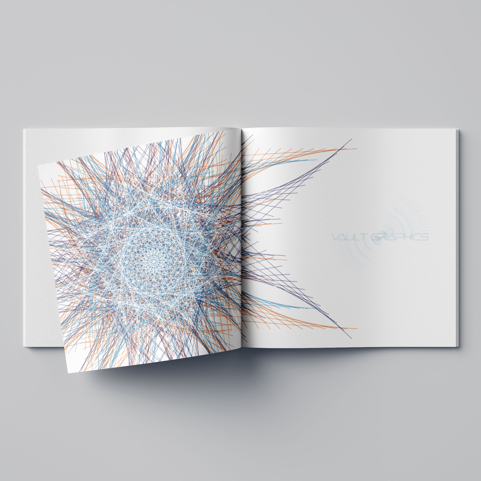
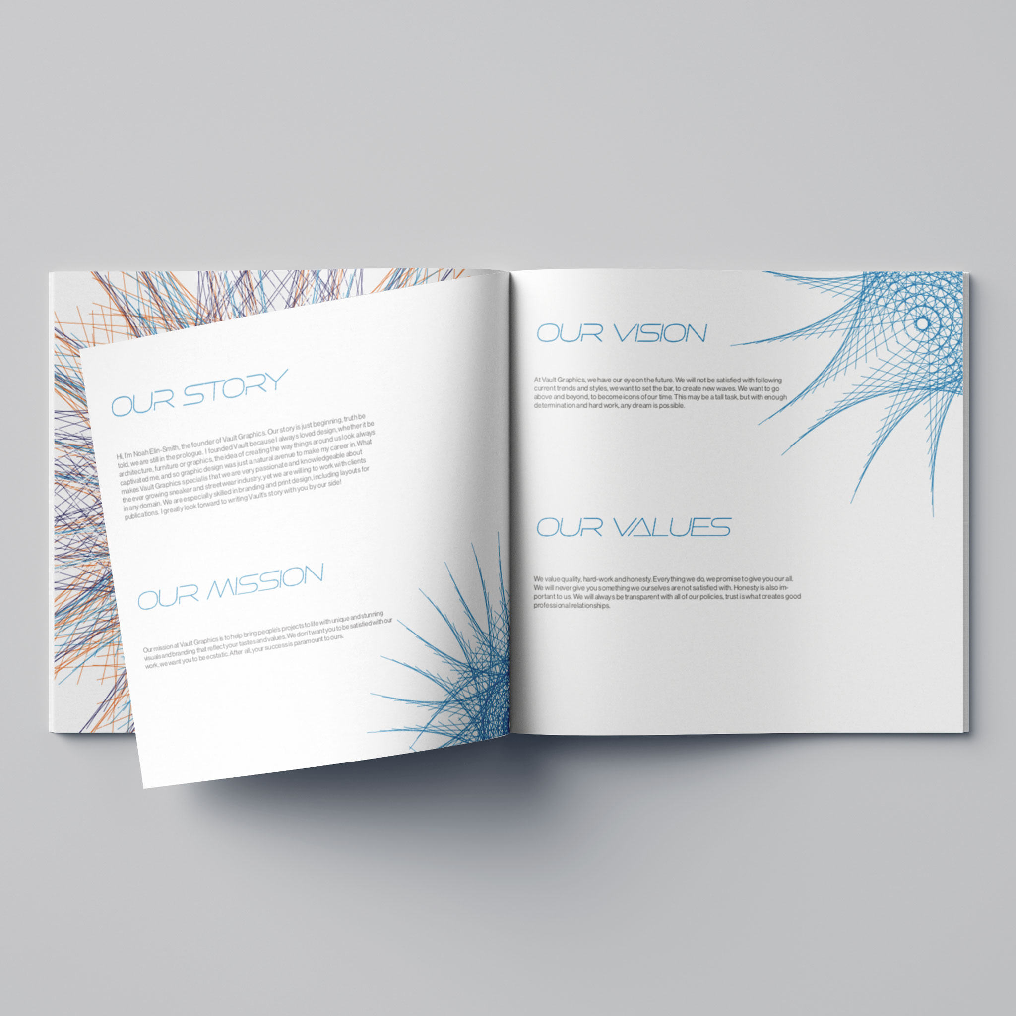
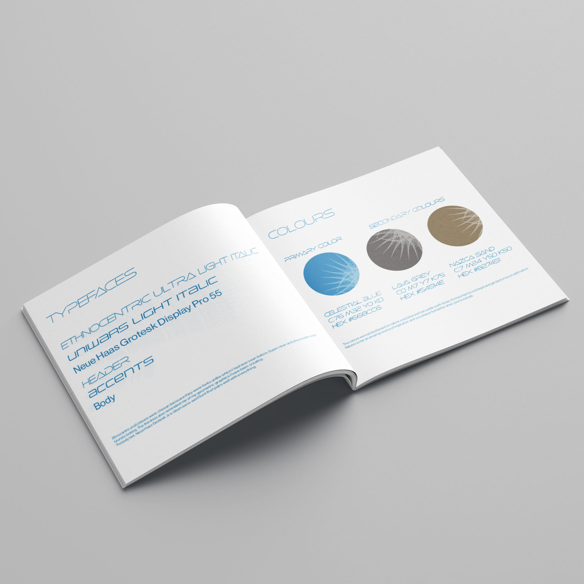
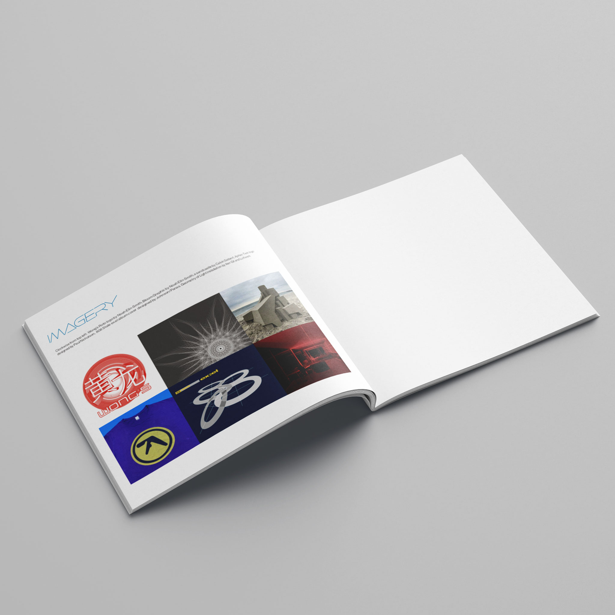
Print Portfolio Booklet
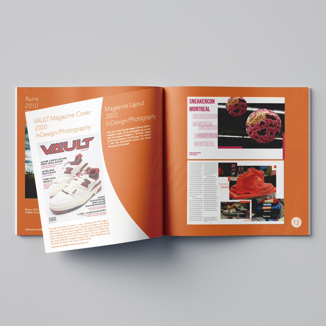
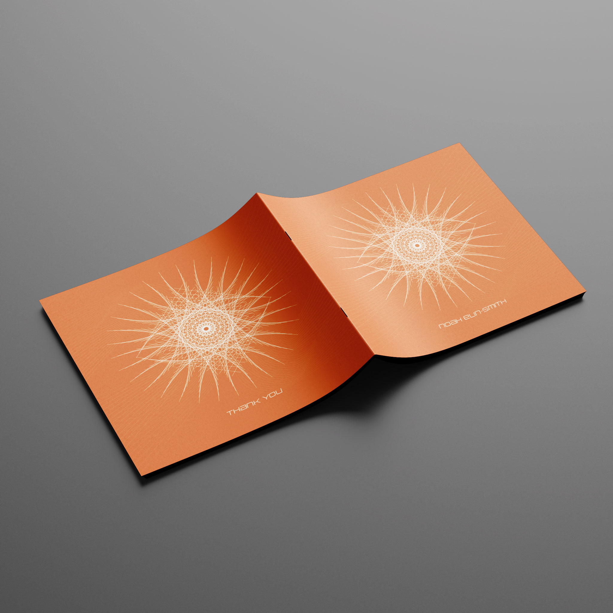
A print booklet design to display a handful of my favorite pieces as well as my page and layout design skills and establish some personal branding.
❮


Sole Purpose Letterhead
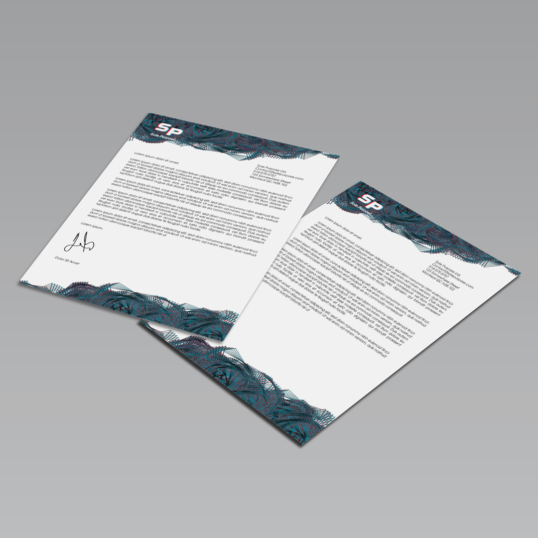
A simple Letterhead design. Complex asymmetrical geometric patterns border the top and bottom of the otherwise simple letter to create contrast and add some flair.
❮
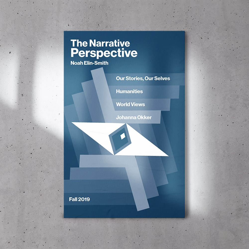
The Narrative Perspective Poster
Here I had to create a cover page for a Humanities class assignment. The main element is an eye, because of the relation between the words perspective and views and sight. Eyes are also often associated with individuality and identity, which ties into the course material well.
❮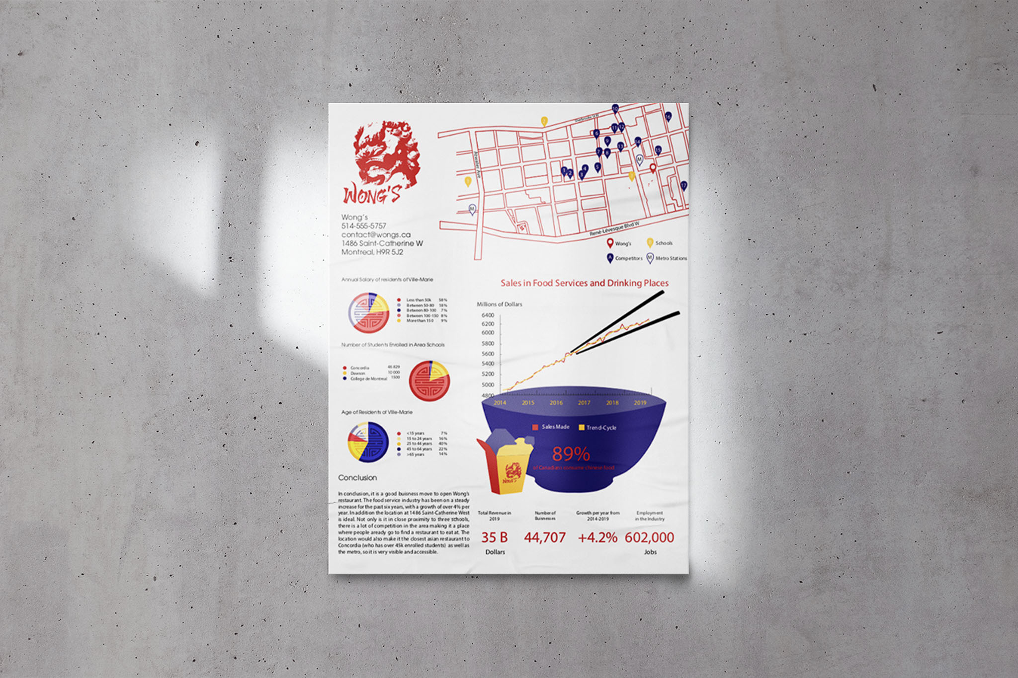
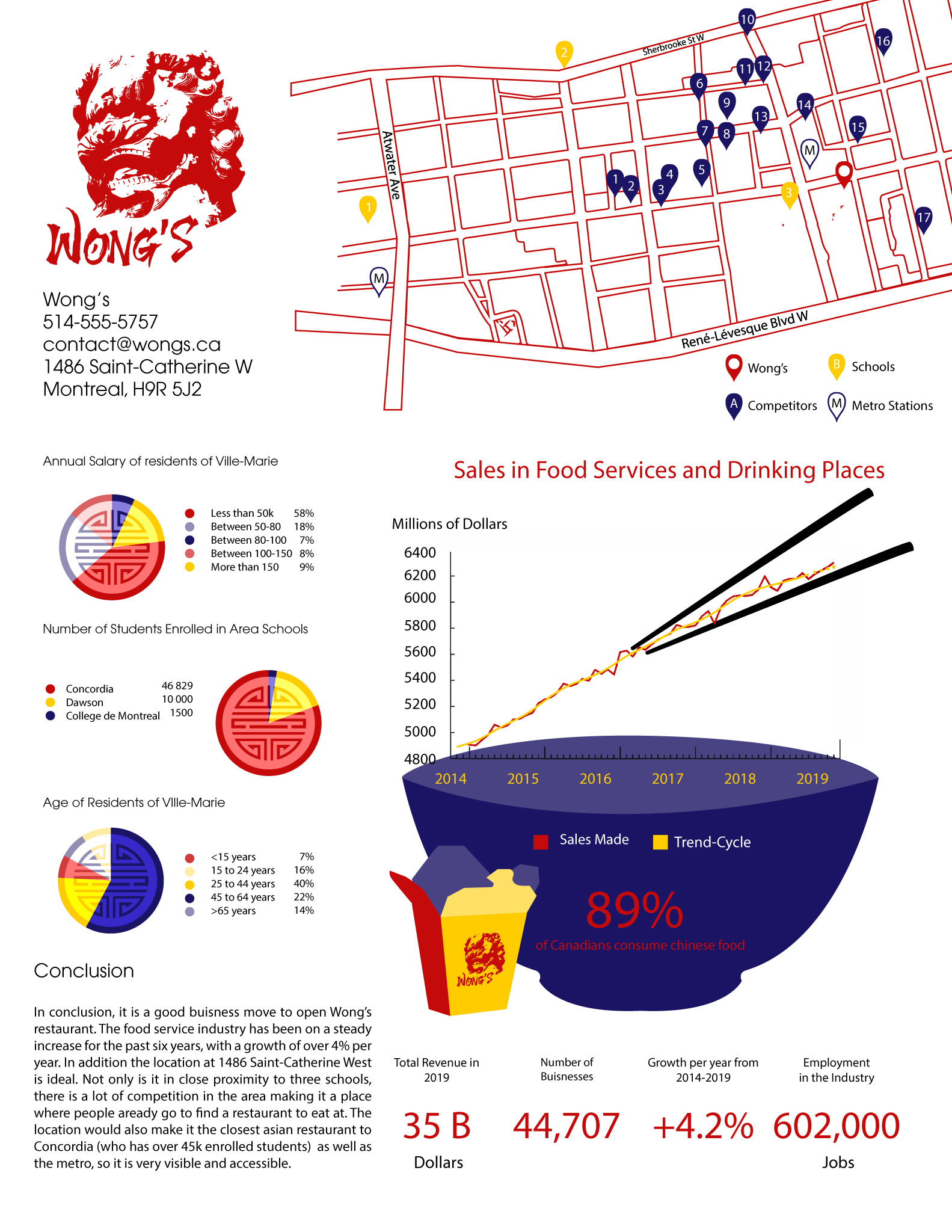
Wong's Infographic
Infographic and rationale as to why opening a Wong’s restaurant would be a good idea. I thought the undulating lines on the graph kind of looked liked ramen, so I added the chopsticks and bowl to spice up the infographic. The pie graphs are or detailed with the shou symbol.
❮

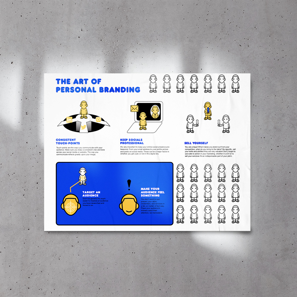
Personal Branding Infographic
An infographic about personal branding. I created two versions, one more chaotic and one simple and clean. I think the assymetrical one works better,as it's more interesting, unique, although both are clean.
❮
Storm Socks Packaging
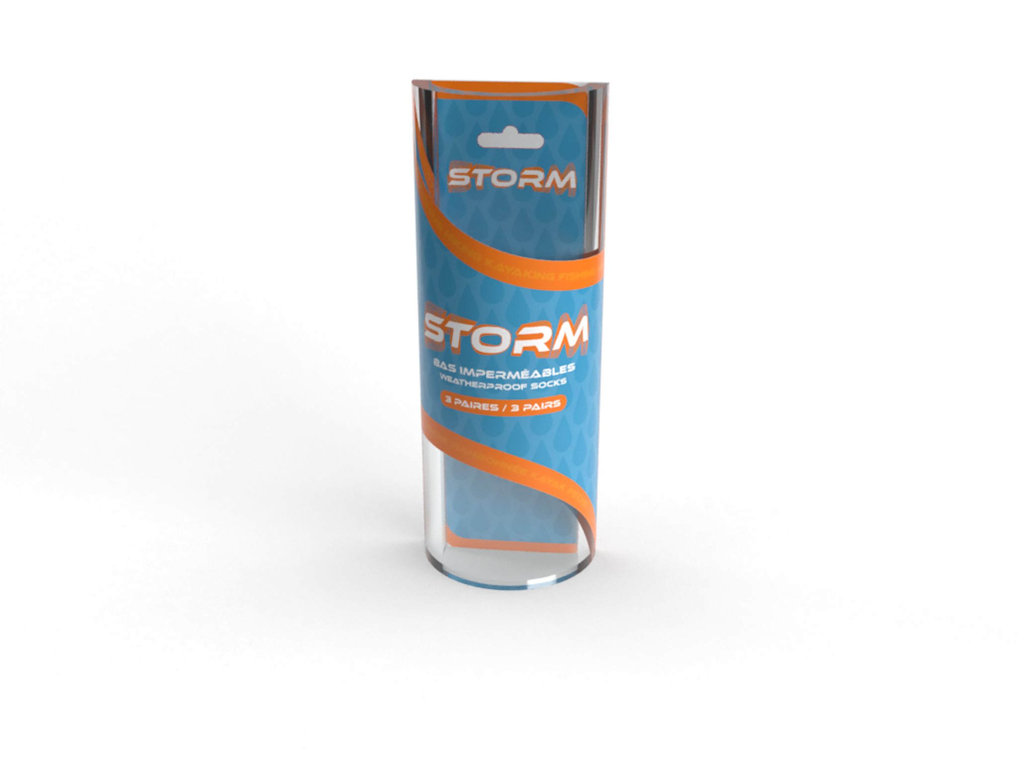
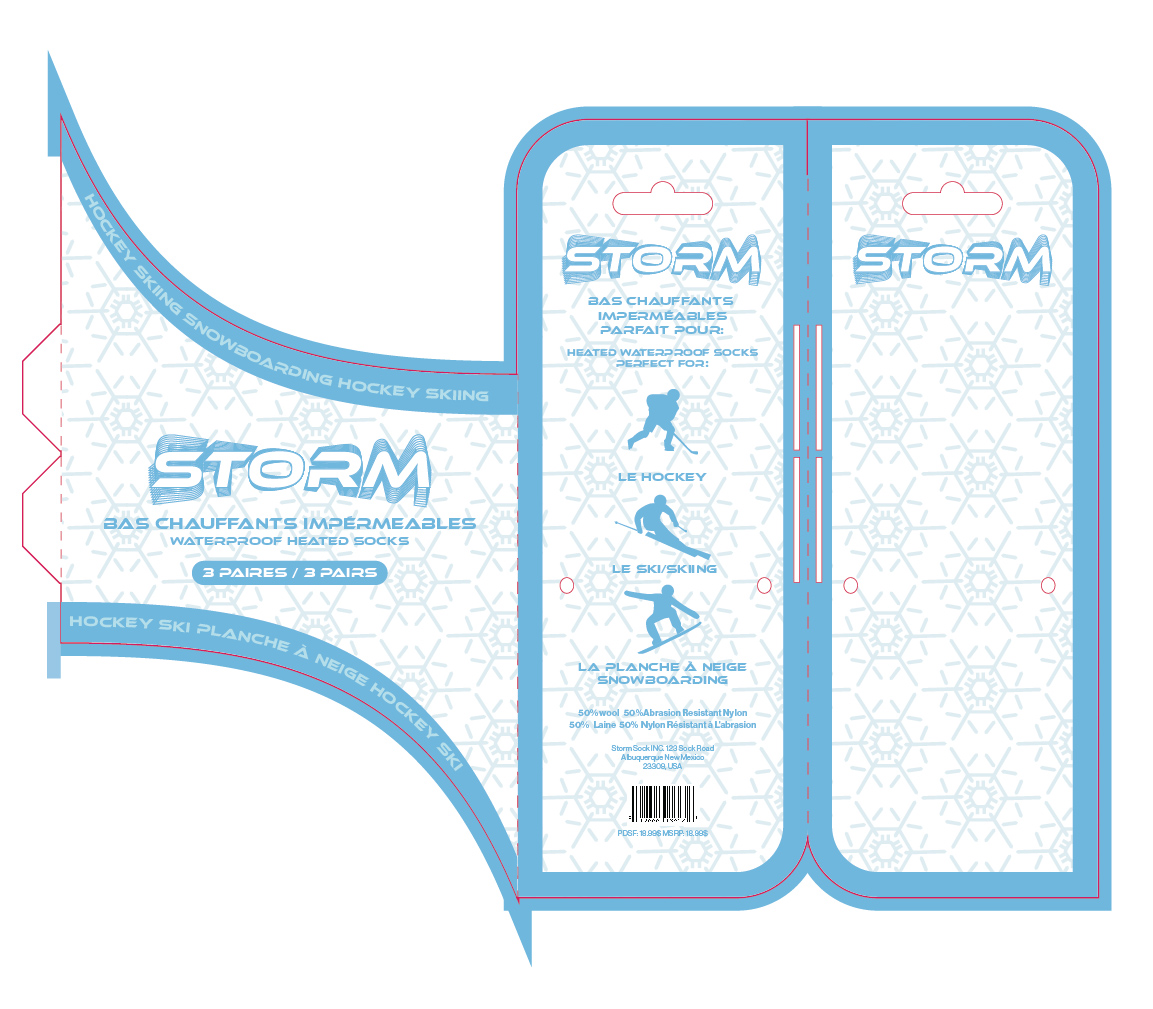
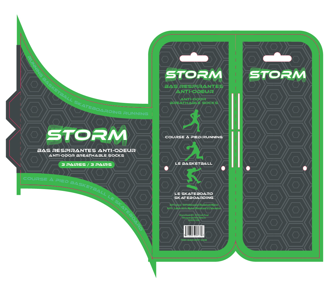
Packaging and custom dieline design for athletic socks. I chose the name Storm because these socks are meant for you to wear when facing the elements, particularly for the waterproof and heated socks. The waterproof socks use a mainly blue design with a subtle water drop pattern and vibrant orange to evoke energy and sport. The heated socks use icy blue and white packaging with a snowflake pattern, while the anti-odor socks use a fresh green, which pops on the ashphalt grey background.
❮
Takeout Container Design
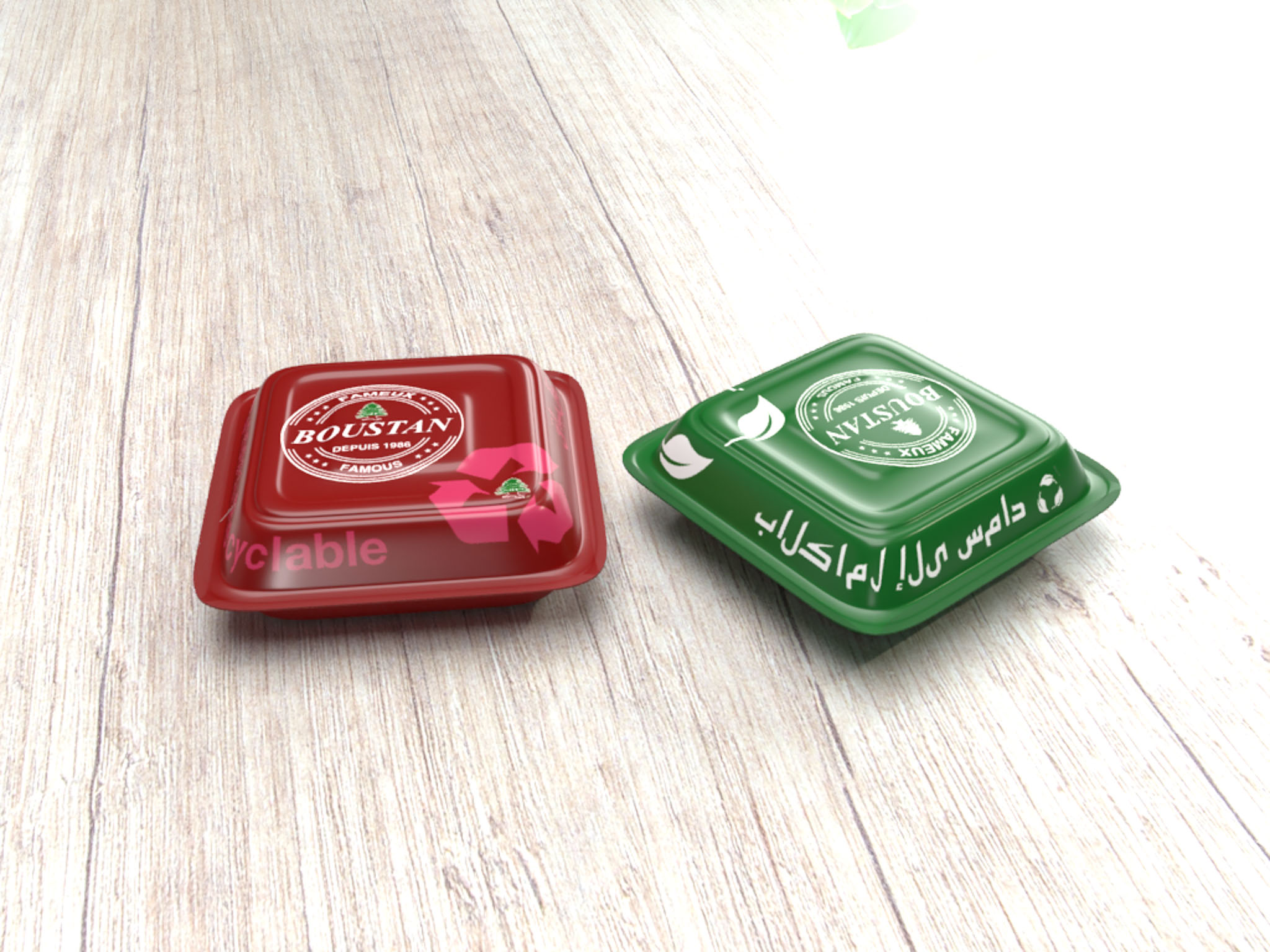
Concept designs for recyclable and compostable takeout containers. We need to replace outdated styrofoam takeout containers. They contribute to landfills while there are many recyclable and compostable alternatives, with similar thermal properties. So, I made the designs very colourful to stand out from the traditional white containers. I also added bold graphic to clearly communicate how they should be disposed.
❮