Track Name
Track Artist
year
genre
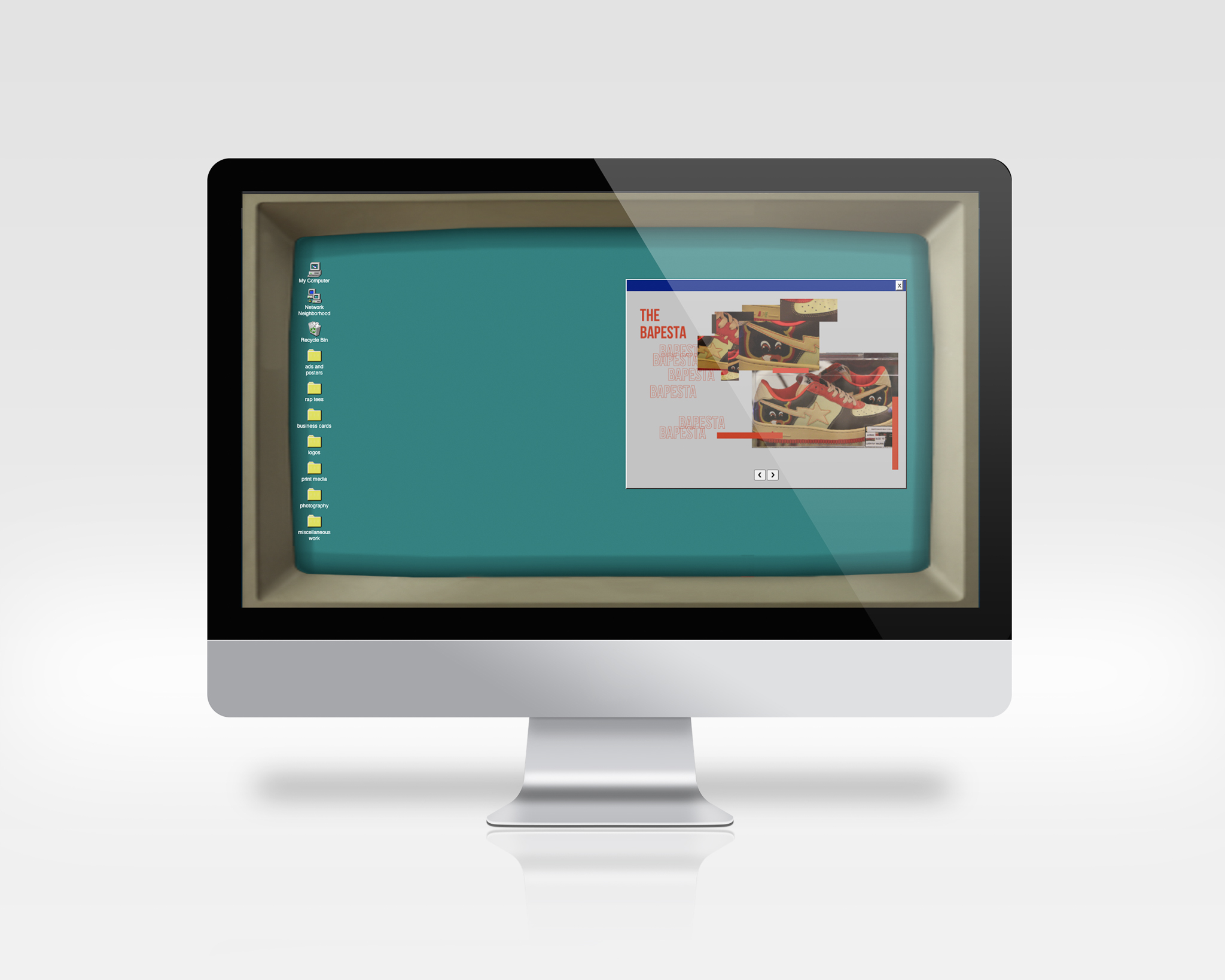
90s Style Portfolio Website
A simple website made to look like an old computer running Windows 95. At the time the windows 95 start up sound was stuck in my head, which is what inspired the idea. I really didn’t want my site to feel like just a regular old portfolio site so, I tried to emulate the old windows operating system. Then, to make it feel more dynamic, I added a screen flicker on loading the site and made folder windows draggable.
❮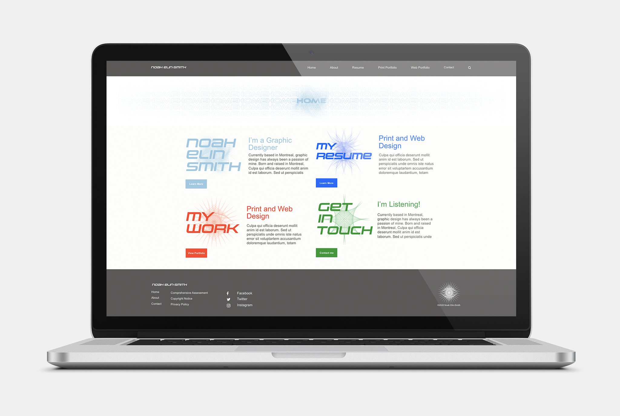
Early 2021 Portfolio Site
My previous site, it was clean but much less abstract and unique than this one. Time constraints also prevented me from fully implementing all the features I designed in my mockup.
❮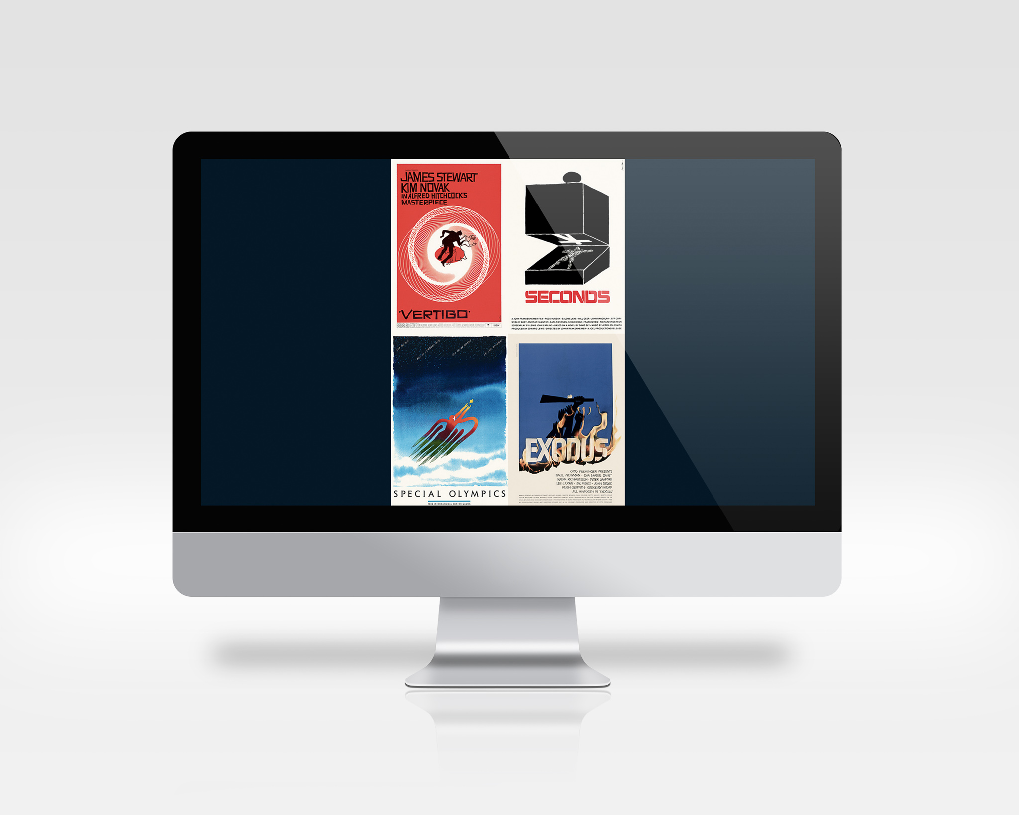
Saul Bass Newsletter
The goal here was to create a web form newsletter for a Museum of Fine Arts exhibit of a famous graphic designer’s work. I chose Saul Bass. We had to display 8 pictures minimum, to save space and create a dimension of interactivity, I used a display of four of his posters, that when each is hovered over fades to display an alternate poster.
❮
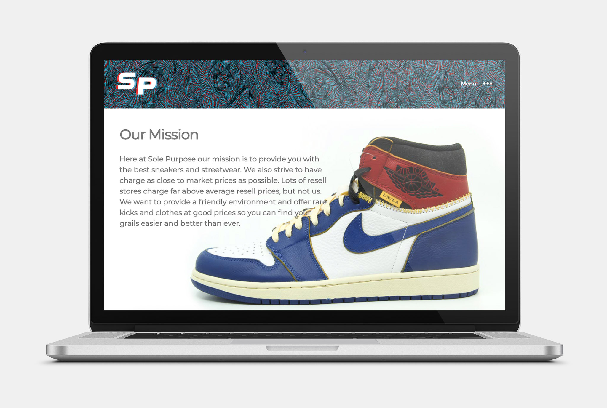
Sole Purpose Website
A website for a conceptual sneaker consignment store. Scrolling down on the home page causes each shoe to almost seamlessly swipe into a new model or colour using the parallax effect. The blog also features some nice header graphics and the round navigation menu, is a nice touch. All photography except the slideshows and picture of Menthol 10s are my own work.
❮